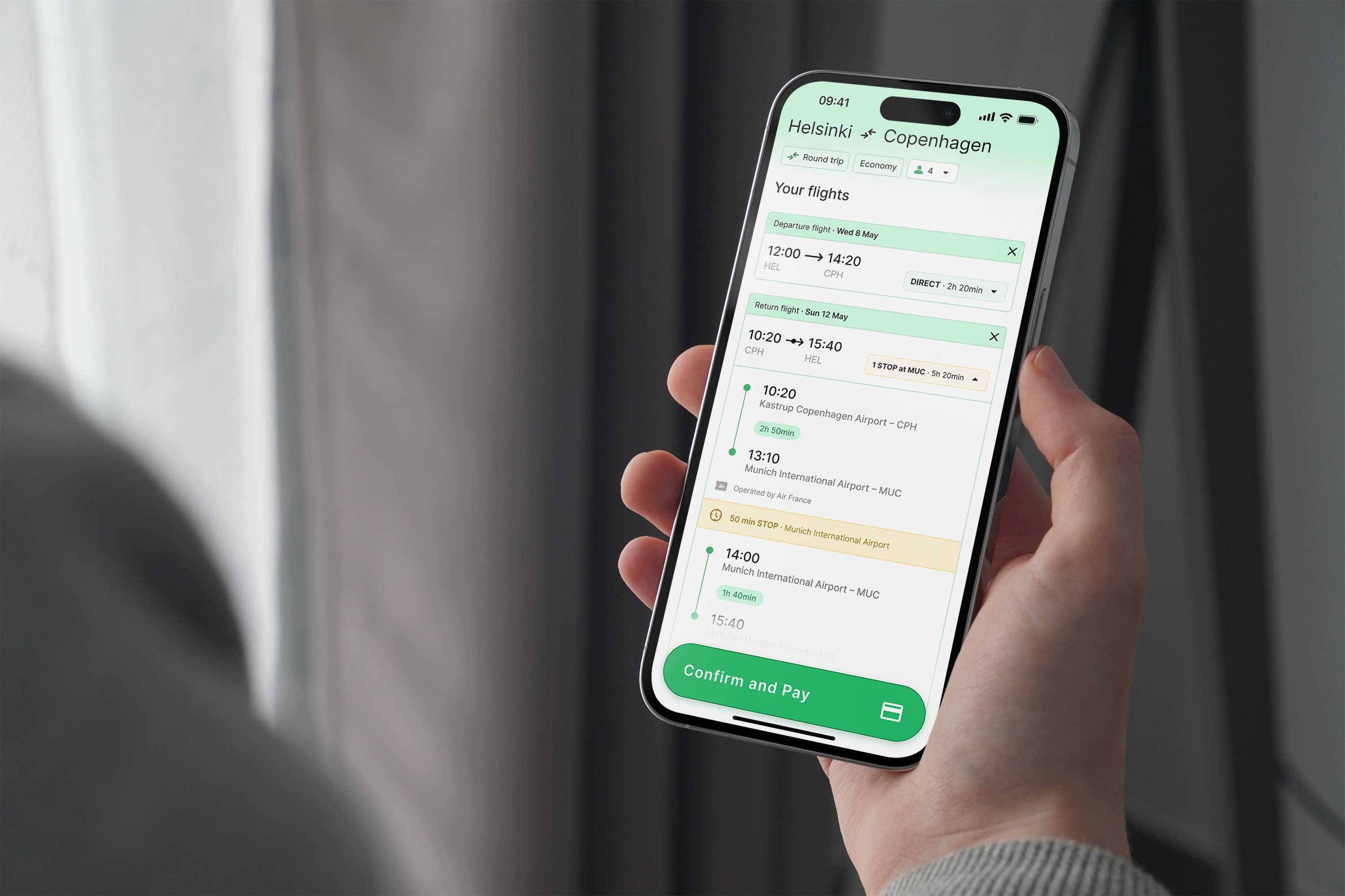
For this project, I had a maximum of 3 hours to improve the clarity and usability of a flight picker. My goal was to create a cleaner interface by focusing on clear trip type selection, simplified date options, a transparent itinerary, and an easy-to-navigate visual hierarchy.
I spent the first hour exploring different apps and websites to understand what they did right and wrong. I quickly noticed significant differences between "Airline booking" and "Multi-Airline booking" sites. The latter are more complex due to the need to juggle connections, multiple airlines, fluctuating prices, and luggage options… A common issue I found was that many sites would leave me at a dead-end if no flights matched my selected date and location, without offering alternatives or different options, which was frustrating and unhelpful.
After this, I jumped into prototyping to better understand the information hierarchies and the specific details that needed to be displayed. This step was crucial for organizing the content effectively and ensuring that I would meet my initial goals.
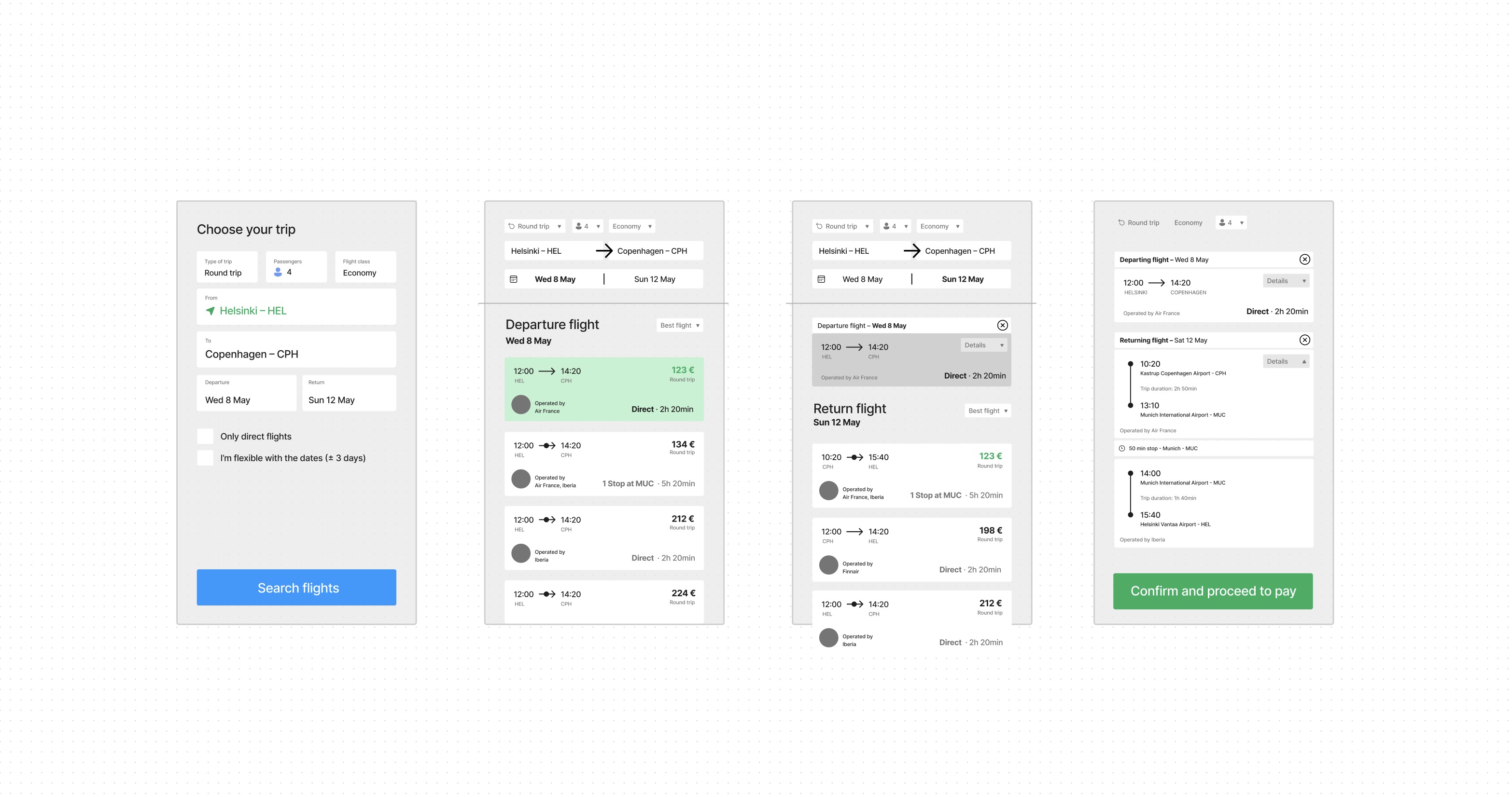
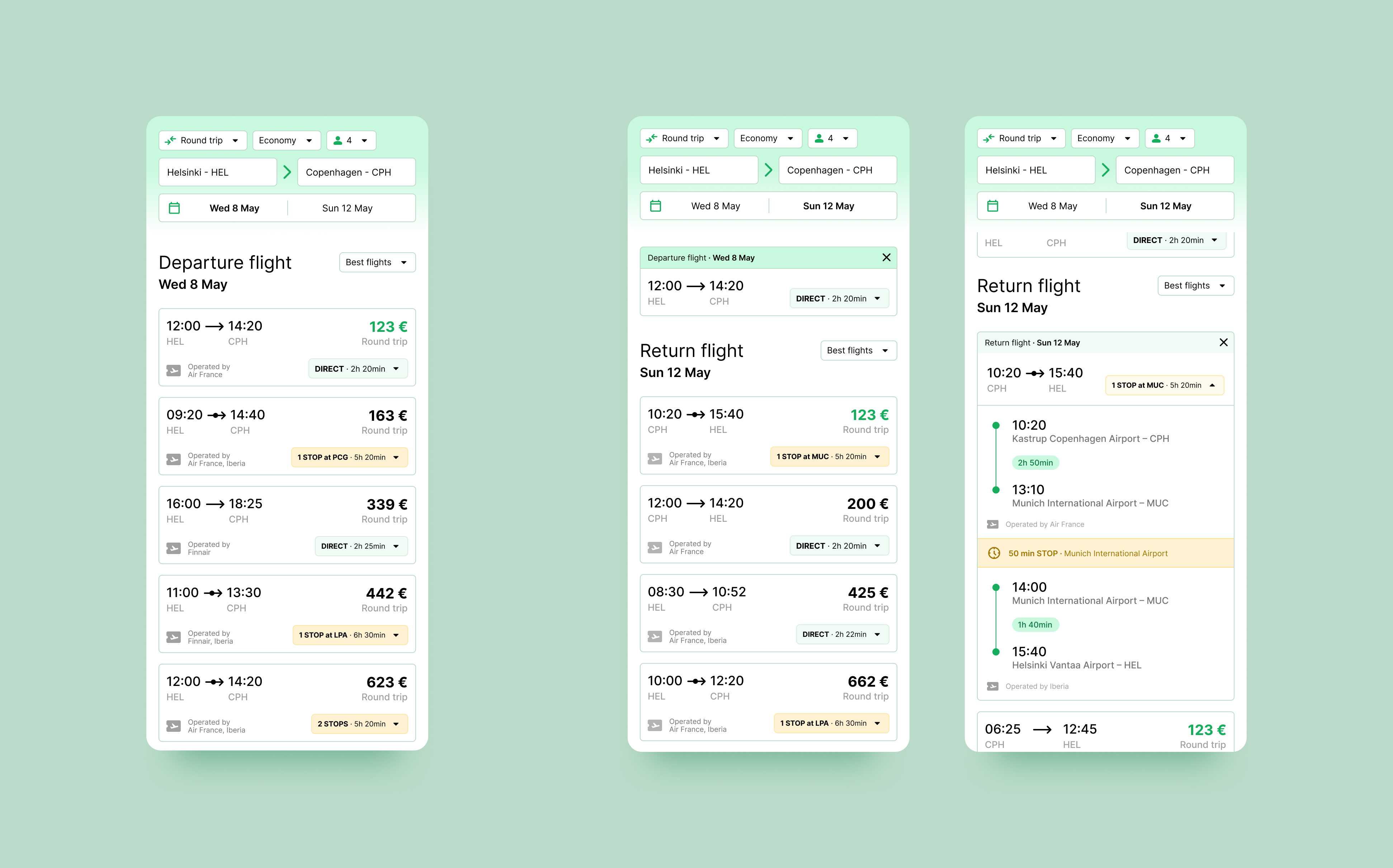
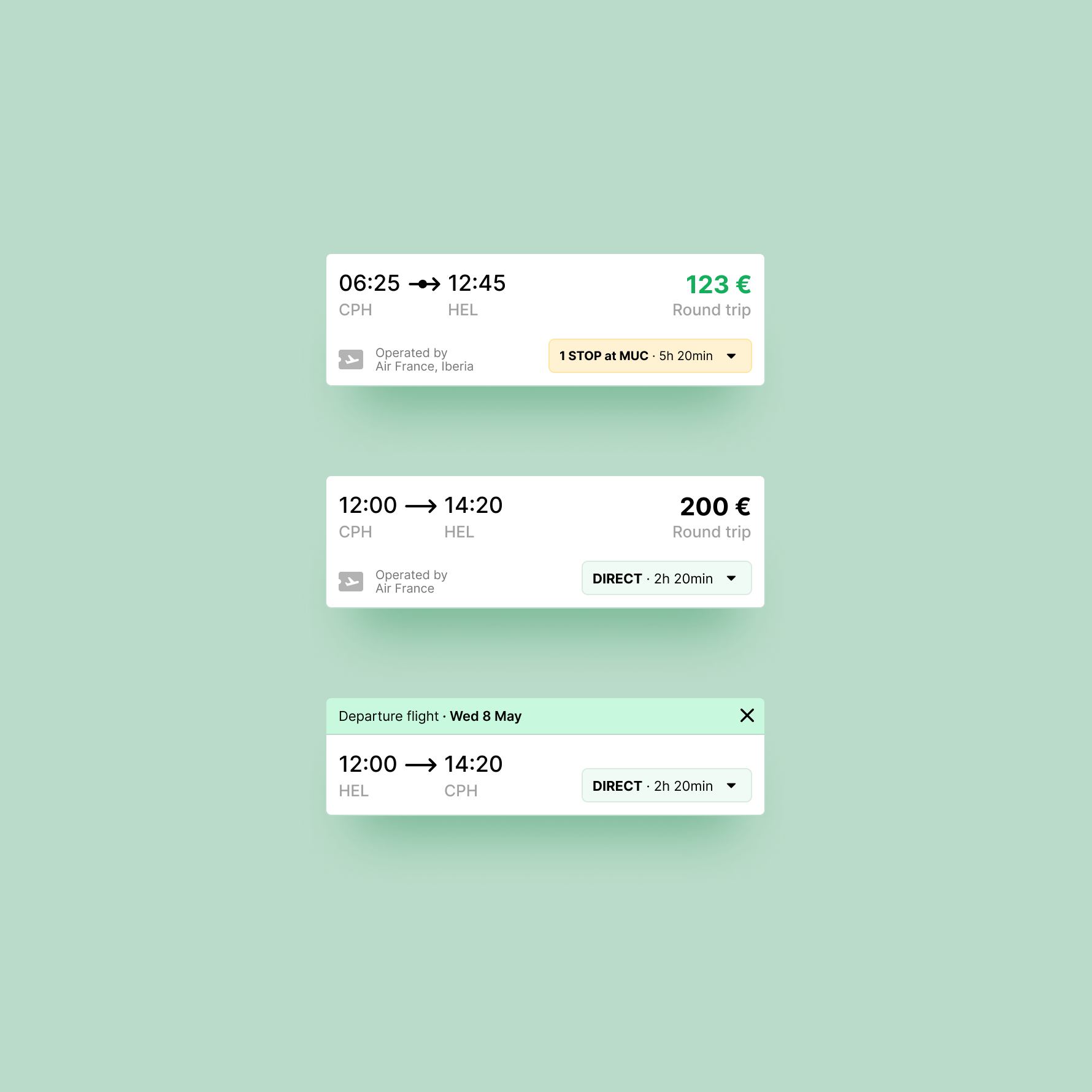
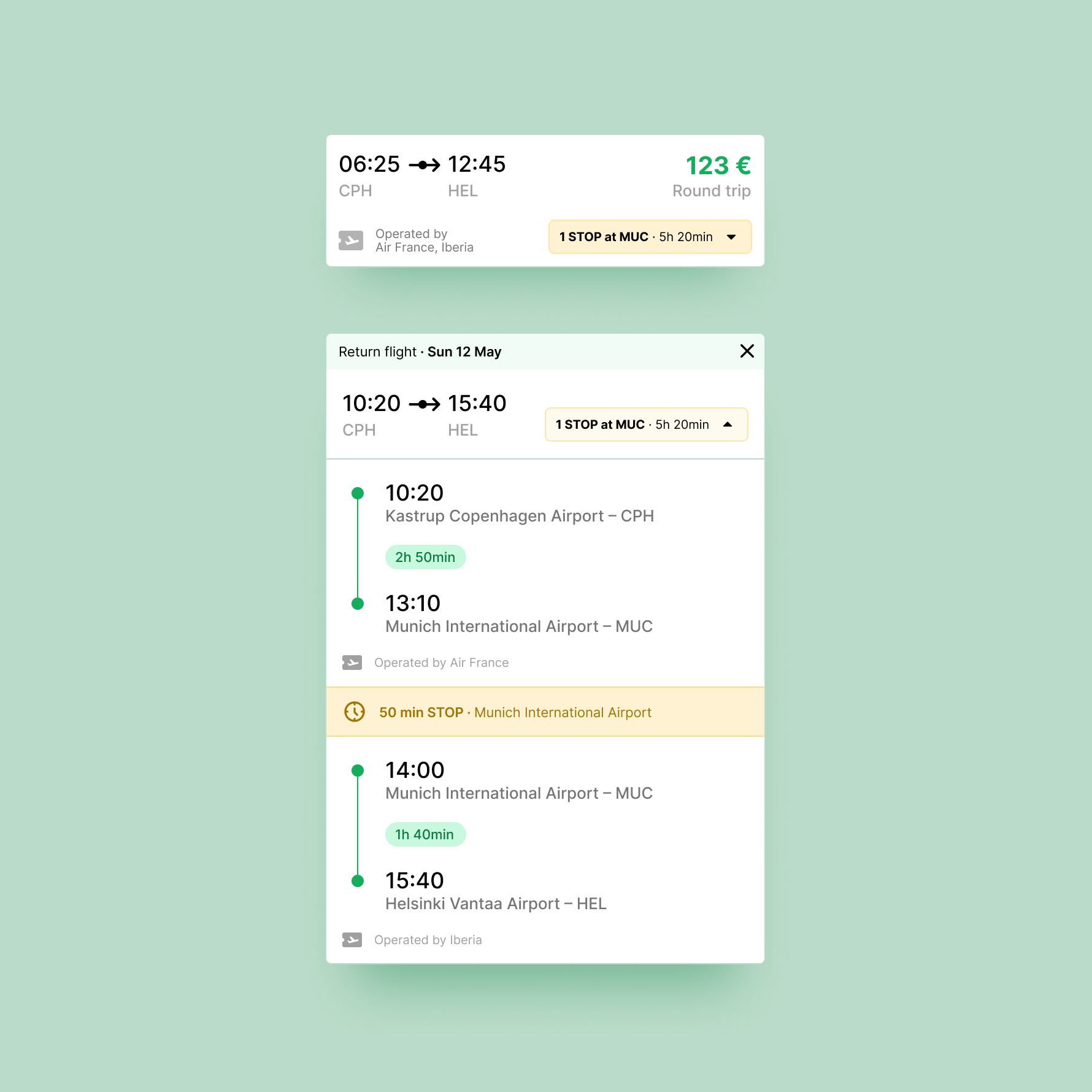
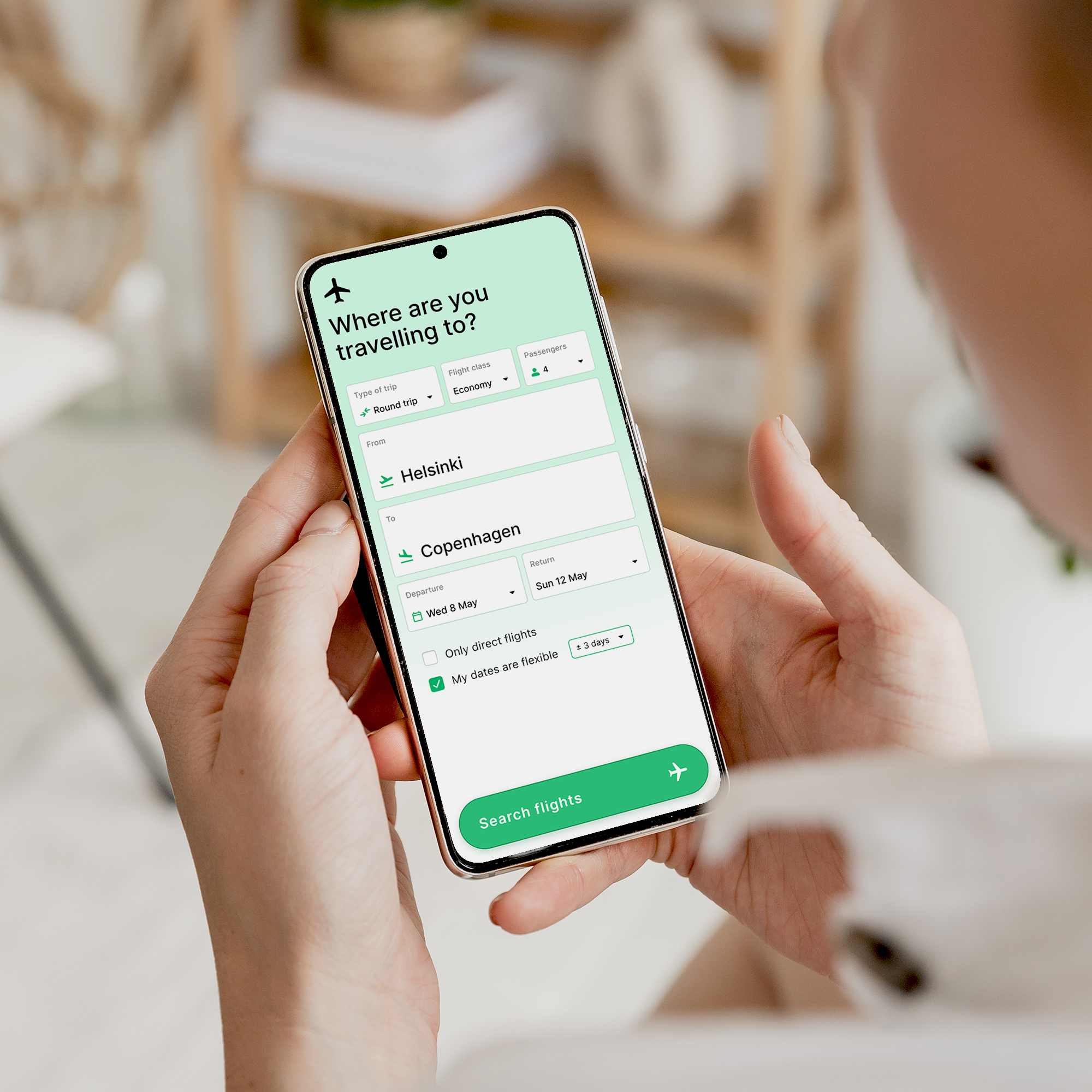
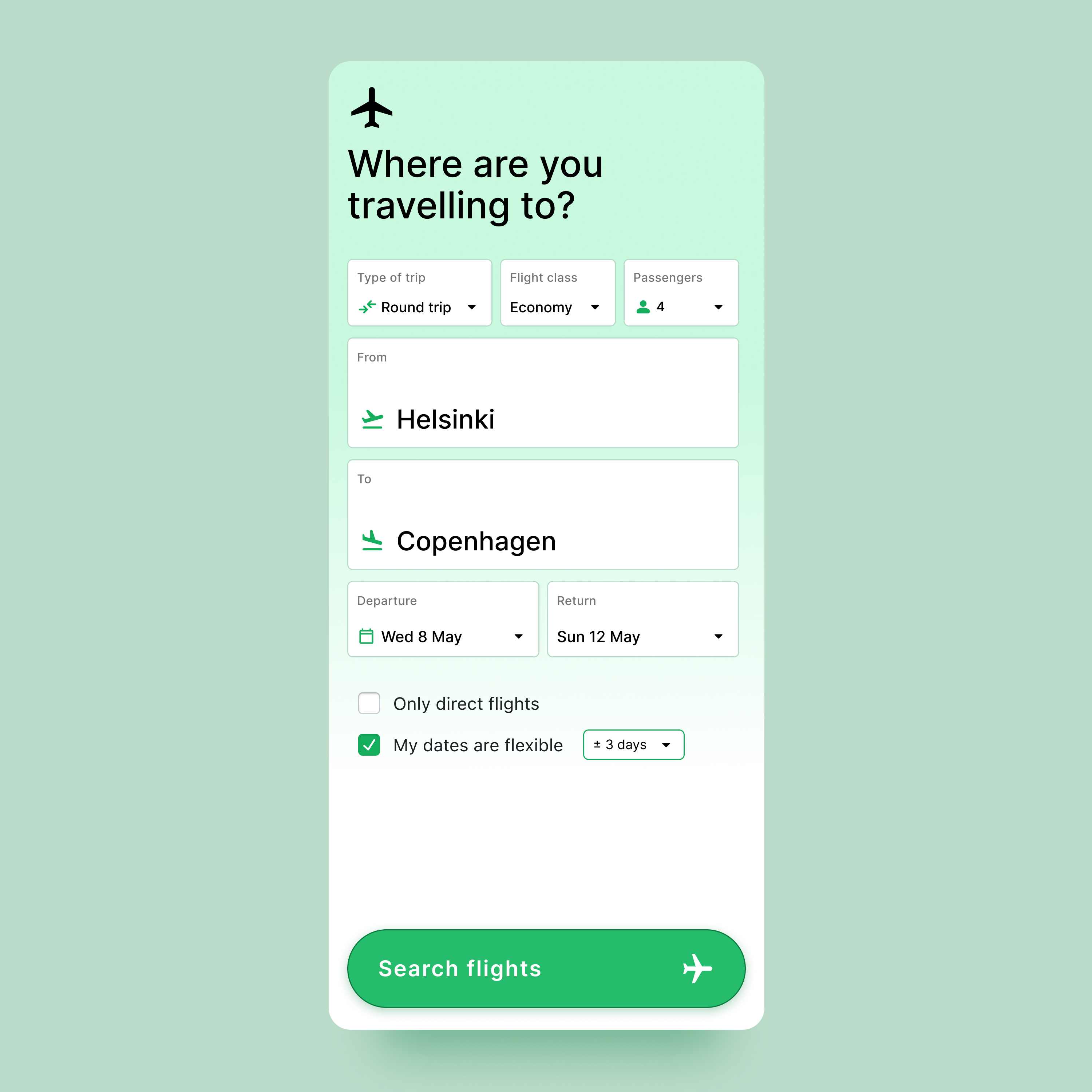
There is also a significant difference between desktop and mobile views. In many cases, phone apps clutter the screen with large elements and boxes that are meant to be helpful but end up creating a hard-to-follow interface with little breathing room. This makes the user experience unpleasant. That's why I chose to make the interface as clear and clean as possible.
My mission is to enhance human interactions through design. This is what drives me in my way to improve people's lives and experiences.